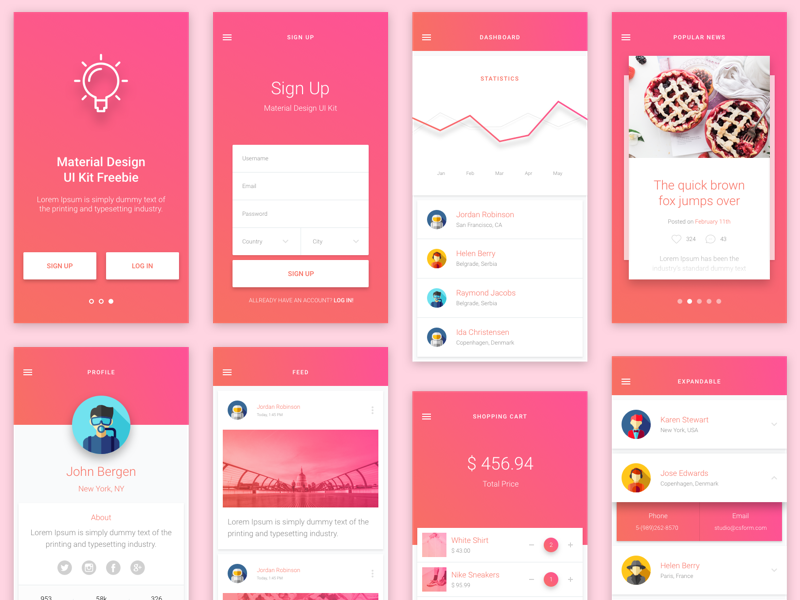
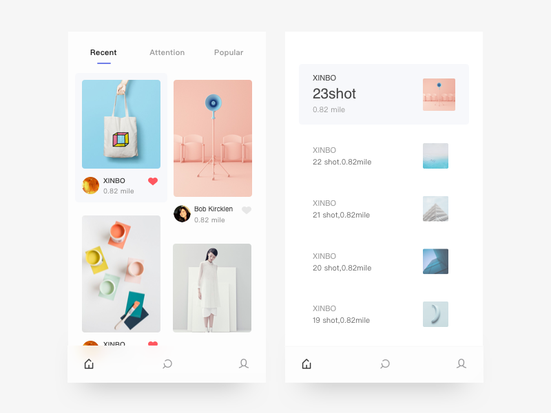
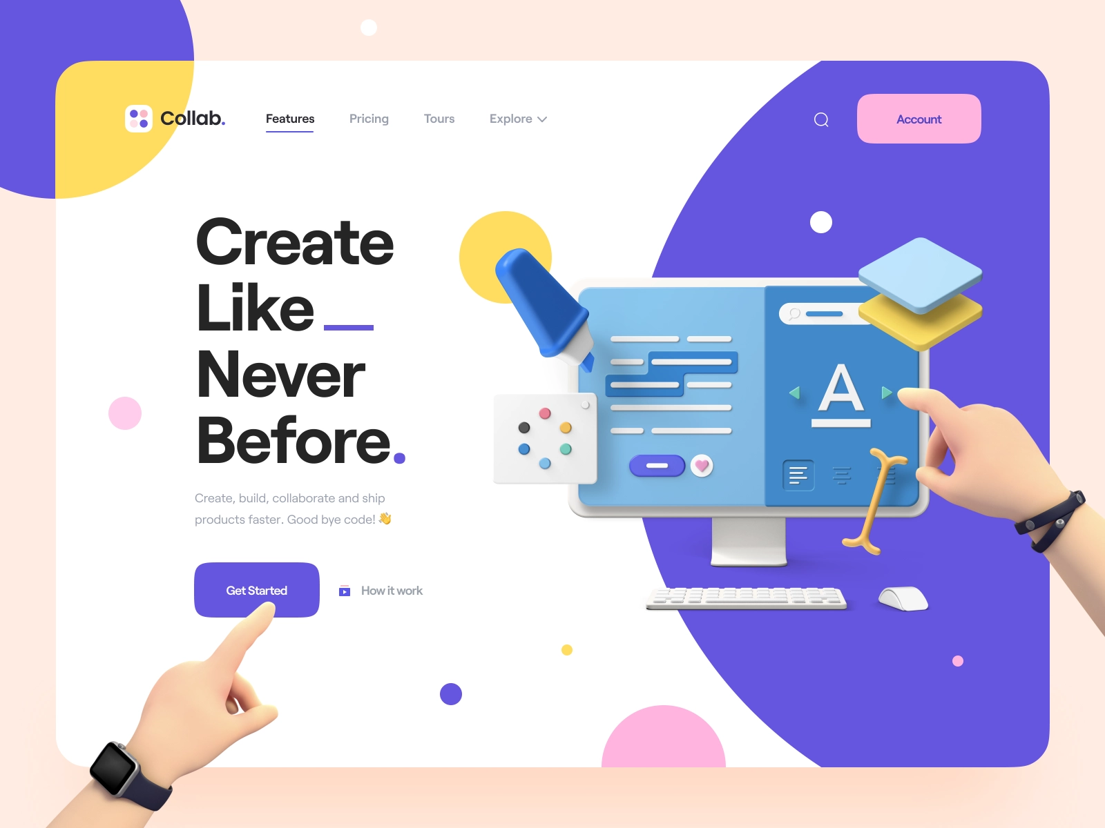
User interface design is everything that a user interacts with when they use a digital product, including buttons, text size, image spacing and layout.
When it's done right, users don't even notice it's happening. In the case of a poor implementation, users are unable to get past it in order to efficiently acquire a product.
In order for a user interface to be effective, it must be appealing to the user. In addition to being beautiful, it is also straightforward to use. Indeed, a well-designed user interface can increase your website's conversion rate by up to 200 percent.…
With these 4 golden rules of UI design, this essay will help you get to your better work at ease.
4 GOLDEN RULES OF EVERY UI DESIGN
Tognazzini, Nielsen, and Shneiderman user interface design principles are widely adopted by most UI designers. And the principles' heuristics have been incorporated into Apple, Google, and Adobe designs.
They can be applied to both standard GUI environments (such as desktop and mobile apps) and non-GUI interfaces (such as chatbots, voice-based interaction systems).
When UI designers talk about best practices, there are four rules that come up again and over again.
Rule 1. Consistency and usability are priorities
Use of similar design patterns, the same vocabulary in prompts, homogeneous menus, and consistent commands throughout the interface are all examples of consistent user interface
Because it helps customers grow comfortable with the digital world of your product, consistency plays a crucial role in helping them accomplish goals more effortlessly.
When designing similar scenarios and sequences of activities, strive for consistency by using recognizable icons, colors, menu hierarchy, call-to-actions, and user flows.

On separate pages of the site, do not use multiple styles for distinct elements. In this case, users should not have to question whether a transformed button means the same thing as it did before it was altered.
It's best to avoid employing new words when the users are already familiar with the existing ones. In other words, users have specific expectations when it comes to naming. Using different terminology could cause children to become confused.
As Mike Gilfillan, Technical Lead Developer at Edge of the Web, explains: "Consistency is key - multiple colors, fonts and styles can create confusion, whilst consistency creates familiarity".
Rule 2. Create a comfortable and transparent environment for the interaction
Verify that the page does not contain anything that could lead a user astray. Important information becomes obscured by irrelevant information, which makes it harder to see.
Informative feedback should be provided to users when they execute activities so that they know if the action was successful.
Design the user interface so that all information on the screen is useful and relevant. As a result of this new rule, users will be relieved that they don't have to worry about contingency preparations anymore.
When it comes to app design, iA Writer is a fantastic example of an app that follows the 'less is more' principle by not overburdening the interface with content or functionality.

There are no distractions with the iA Writer app's UI, which is a simple typing sheet. As a result, people can concentrate on what they're writing while everything else is hidden.
Don't make people re-enter data they've already provided. Most users dislike long data entry sequences.
Using language that is easy to read and understand is also vital when building a product. Instead of using jargon or system-oriented terms, the system should speak the user's language, using words, phrases, and concepts that are recognizable to the end user.
Rule 3. Avoid overwhelming your audience
Users' short-term memory strain should be reduced by designers. People who utilize well-designed user interfaces feel like they have some influence over their environment.
As long as users feel in control, they will learn quickly and achieve a sense of mastery soon. In this way, users don't have to be afraid of making mistakes, which encourages them to explore new choices.

It's a good idea to keep in mind that most individuals can only recall seven bits of information at a time, plus or minus two.
Users also don't have the patience for long data entering sequences, therefore attempt to limit the number of users you need to a maximum.
Navigating should always be simple and obvious to the user. When using a software product, the user should be able to have fun exploring the interface.
There's nothing worse for users than seeing nothing on their device's screen while the app is meant to be doing something else on the device. Users' comfort and enjoyment can be greatly enhanced by the usage of progress indicators.
Rule 4. Prevent errors as much as possible
As a UI designer, you need to test the design with users before publishing it as a designer to make sure everything works as intended.
Your product's functioning and usability may be tested, and the needs of your target audience can be better understood through this process.
An online storage program shouldn't have the "delete" button in a conspicuous spot where it can be unintentionally clicked or pressed).

However, occasionally errors happen. Whenever someone makes an error, make sure to give them a clear explanation of what went wrong, as well as an easy method to fix the problem.
There should be a way to reverse actions if an error is made. In particular, the ability to easily reverse actions reduces user fear and stimulates the investigation of new options.
CONCLUSION
Remember all these golden rules of UI design guidelines and concepts when working on your next user interface design project, and you'll end up with a product that's not just attractive, but also user-friendly.
If you are still struggling with UI design, why don't you contact us - Golden Owl? With a whole expertised team with all senior UI designers, we can ensure your web or app design will be just what your clients are looking for!


